
A good document viewer does two simple things: it keeps people on the page and lets them get work done without juggling downloads. When you embed a viewer that loads quickly, announces itself to assistive tech, and integrates smoothly into your topic cluster, you achieve the quiet wins that truly matter. It includes lower bounce, better task completion, and fewer support questions that start with “where’s the file?”
What follows is a practical, field-tested way to ship a viewer that reads naturally for humans and makes sense to search engines.
In this blog post, I will explain why you need a website document viewer and how to align its implementation with SEO and UX best practices.
Why embed a website document viewer at all?
Downloads are a black box. Someone clicks, the tab ends, and you have no idea if they ever read page two. An embedded viewer turns that into a story you can measure: search queries inside the doc, pages viewed, time-on-doc, and comments added. More importantly, readers stay in context.
They compare specs, sign off on a policy, or leave a note for legal without leaving the page. If you still need a PDF for compliance, keep it as the understudy. Lead with the in-page experience and let the file sit one click away. When annotations and review are part of the workflow, a framework pattern for in-app document preview and annotation keeps everyone in one flow instead of hopping between tools.
Make search engines happy without handing them the raw file
Treat the HTML page as the primary asset and the document as evidence. If a file shouldn’t appear in results, send X-Robots-Tag: noindex on the file route and keep the HTML page canonical to itself. Give that page a plain-English H1—“Security Policy (2025) — PDF Viewer” beats “policy.pdf”—and a short intro that says what’s inside and who it’s for.
Mirror the crucial bits in HTML so searchers can land on an answer, not just a rectangle. Link the page into your cluster so it inherits context from related guides. Your own explainer on SEO-friendly content writing is a handy reference for the tone and structure that the page should use.
Here’s the spirit of the setup:
- File response (PDF): X-Robots-Tag: noindex
- HTML page: <link rel=”canonical” href=”https://example.com/policies/security/”>
- H1 + 2–3 sentence summary above the fold
- Viewer below the fold, in a stable container
That tiny separation—story up top, evidence below—removes most “orphaned PDF” problems and keeps your rankings focused on the page that deserves them.
Performance: Protect your Core Web Vitals like they’re KPIs (because they are)
Viewers can be heavy. They parse complex files, render pages, and expose tools, which is great for users, but rough on the main thread. Keep the first paint clean. Use a reserved container with fixed dimensions to prevent the layout from jumping. Lazy-initialize the viewer with Intersection Observer when the container is near the viewport, and defer non-critical controls (search, thumbnails) until first interaction. If your renderer supports it, offload parsing to a web worker. When documents embed giant images, cap render sizes and let users zoom on demand.
Per Google’s thresholds, shoot for LCP ≤ 2.5 s, INP < 200 ms, and a stable layout (CLS ≈ 0). The definitions and targets are all in Google’s Core Web Vitals overview, and they’re worth baking into your “definition of done.” A fast viewer doesn’t need to be spartan; it just needs to sequence work so the first impression lands quickly and the rest catches up without stutter.
A small trick that plays well: show a poster image of page one while the real viewer warms up. It buys perceived speed and lets readers confirm they’re in the right place. Preload only what you need for the first interaction, not the entire 200-page manual.
Accessibility that doesn’t feel bolted on
A viewer is half document, half app. Screen readers will only understand it if you speak clearly. Start with semantic HTML around the viewer, real headings, landmark roles, and layer ARIA where you need it: toolbars, menus, dialogs. If you draw content on <canvas>, announce page changes and selection states via polite live regions.
Every control should be reachable and operable with a keyboard. Focus shouldn’t vanish into the void after closing “Print” or “Search.” If highlights are part of the workflow, offer more than fluorescent yellow; many users can’t see it on white. The patterns you’ll learn on the menu button, tabs, and dialogue are documented well in WAI-ARIA Authoring Practices, and following them prevents a lot of accidental anti-patterns.
UX that respects attention
Open with context, not the widget. A title, a two-line abstract (“What’s inside, who it’s for”), and a “View document” button that starts instantly are all you need above the fold. Inside the viewer, keep the chrome predictable: page thumbnails on the left, search at the top, page nav close to the reading area.
Add a “copy link to page” action; it’s the difference between “check the third section” and a precise deep link your teammate will actually use. If signatures are involved, nudge readers through a mandatory review step so people don’t approve the wrong version. When the doc includes images, treat them like any other site asset. Compress, resize, and choose sane formats.
Implementation notes you’ll actually use
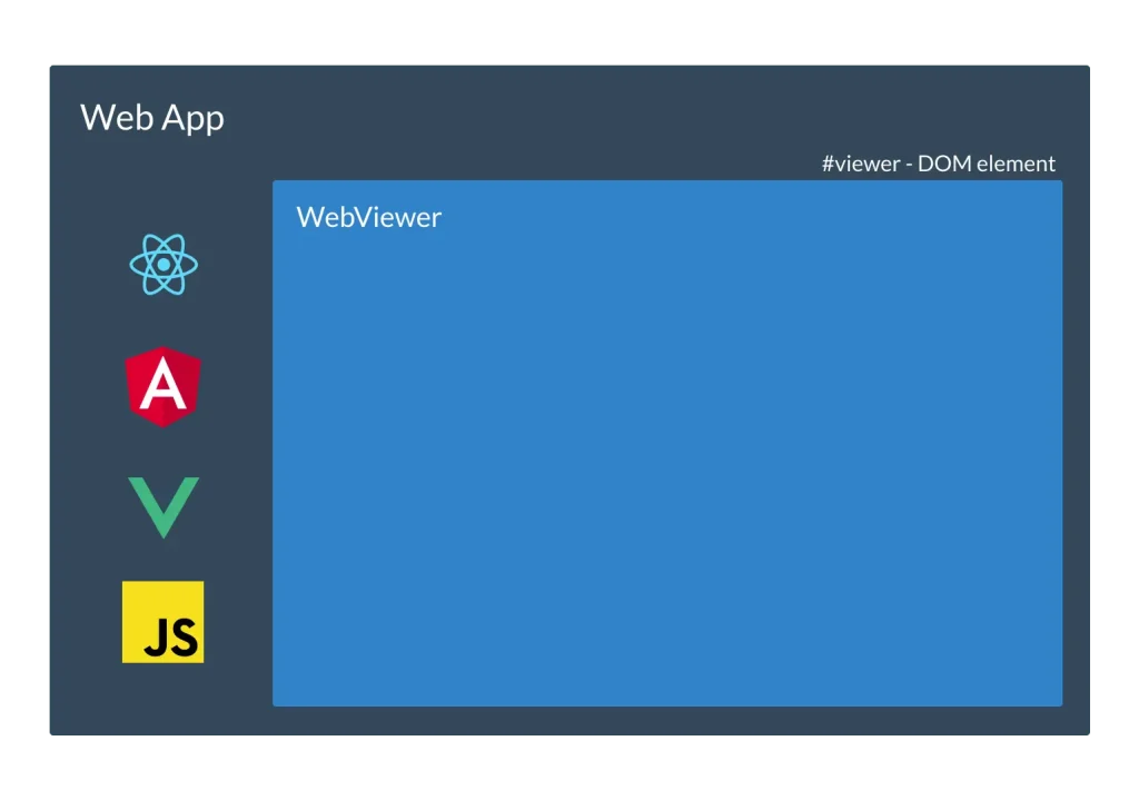
Most teams don’t want to build a rendering engine. They want preview, notes, and maybe redaction without reinventing the wheel. A React-ready SDK gives you that and lets you focus on the experience. A reference approach for inline document annotation covers rendering, comments, and review flows without punishing load times. Keep the bundle split.
Feature-gate heavier tools (OCR, stamps) so they load only when clicked. On the server side, send cache-friendly headers for public docs, short-lived signed URLs for private ones, and avoid caching personalized links in shared proxies.
Instrument the viewer with events that tell a story: first interaction time, pages viewed, search queries, annotations added, and “done” actions like Download or Sign. Those metrics reveal whether the viewer helps, stalls, or just looks shiny in screenshots.
On-page SEO: make the page part of a larger conversation
The viewer page shouldn’t live alone. Give it a descriptive H1 that matches the query family you’re targeting, a short summary that explains the value in normal language, and internal links that connect it to the rest of your content.
A tidy FAQ at the end, “Can I download this?” “How do I print with comments?” often earns rich results and saves support time. Keep the slug human and stable; if you must version policies, put the canonical on the current page and keep an archive.
Case studies: What changed when teams embedded viewers
A B2B SaaS support team moved setup guides out of a download-only library and into an embedded viewer inside their docs hub. Before the change, people downloaded PDFs and promptly opened tickets asking for the same steps. After they added search, page anchors, and deep-linking, organic time-on-page climbed, long-tail queries like “{product} SSO setup step 4” started to land on the HTML summaries, and tickets tagged “can’t find instructions” fell off. The team didn’t chase vanity metrics; they watched “first interaction time” and “pages viewed” in the viewer, then rewrote weak sections. The win was clarity, not fancy UI.
A university registrar had the opposite constraint: policy documents needed to remain official PDFs. Students, however, needed quick answers. The team wrote short HTML intros—what the policy covered, who it applied to—and placed the viewer below the fold with an obvious search field. Searches began landing on those intros instead of the file itself, accessibility complaints cooled, and updates were painless. When the submission deadline changed, they edited twelve words in the intro and pushed it live in under a minute. The PDF stayed untouched and authoritative.
An e-commerce brand hosting product manuals tucked a slim viewer into their PDPs. Shoppers could confirm dimensions, wiring diagrams, and compatibility without leaving the page. Returns for “wrong size” dipped. The product team also noticed a new signal: viewers who searched “install step 3” often stalled. They rewrote that step, added a clearer diagram, and the “step 3” searches evaporated the following release. No extra surveys. No guesswork. The viewer itself exposed the friction.
Security and privacy
If documents contain personal or sensitive data, gate access and keep the cache short. Use HTTPS (everywhere), set a tight Content Security Policy, and be explicit with script-src, style-src, and connect-src. Suppose you allow uploads, virus-scan at ingress and validate MIME types server-side. Avoid leaking query strings in referrers; audit how your viewer opens new windows and how analytics scripts send events. None of this needs to slow the first paint—most of it is policy, not payload.
Common mistakes you should avoid
Dropping the viewer at the very top of the page looks dramatic and wrecks LCP. Rendering thumbnails for all 300 pages on first load feels thorough and melts memory. Hiding the download button creates support tickets.
Requiring a mouse for zoom or next page quietly excludes keyboard users. These are easy fixes. Reserve space, lazy-initialize, throttle thumbnail generation, and give every control a keyboard path. If the viewer draws to canvas, remember to announce page changes and selection states so screen readers aren’t guessing.
Conclusion: small choices, durable wins
A high-quality website document viewer doesn’t need to be heavy or mysterious. Sequence the load so the first paint feels instant. Speak clearly to assistive tech. Let the HTML page carry the story and the document supply the proof.
Do those things and your website document viewer becomes a quiet workhorse for both SEO and UX—easy to find, simple to use, and strong enough to handle the boring, important work of reading, reviewing, and getting to “done.”
Need custom app with amazing features?
Get a Quote