Let me ask you something: “Have you ever put hours into building a landing page, only to watch visitors bounce away without converting?”
I have been there, and it is frustrating. You know your offer is good, but something on the page just isn’t clicking. The truth is, a few small tweaks can make a massive difference.
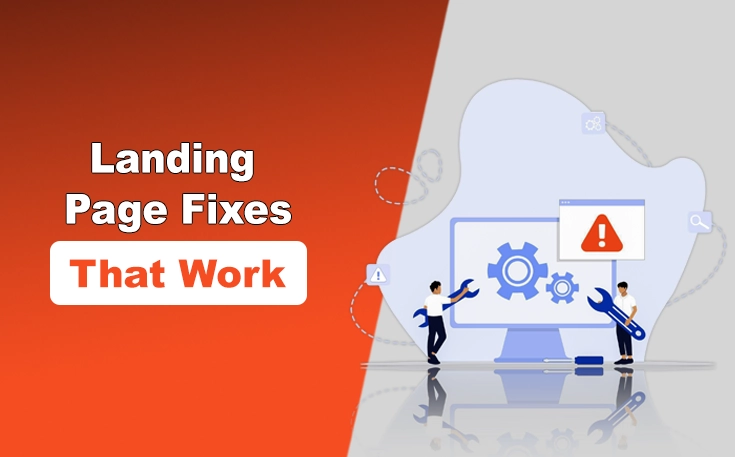
That’s why I want to guide you through five landing page fixes that actually work. I have tested them, seen the results, and now I’m breaking them down so you can improve your own pages with confidence.
5 Landing Page Fixes That Work
After talking to the professionals in the digital industry and also with custom software developers, I have enlisted the 5 landing page fixes that work quite effectively.
Fix 1 – Match Your Headline to What People Search For
3 seconds is the time your headline has to make sense. Otherwise, your visitor is gone. According to Nielsen Norman Group, visitors tend to close a site in 10-20 seconds. Unless your target page has a straightforward value proposition that draws attention. That value starts at the top.
The Problem?
- Vague taglines like “We streamline your business” don’t say what you really do.
- Headlines often overlook user intent from ads or organic search.
Why Conversions Die?
- Visitors feel unsure if they have landed in the right place. Or they are just not convinced you have got exactly what they need.
- They bounce before reading any supporting content.
The Fix?
- Analyze your top-performing queries in Google Ads and Search Console.
- Group them by intent (problem-aware, solution-aware, product-aware).
- Craft 3-5 headlines per page tailored to these stages.
Implementation
- Use keyword mapping to align each ad group or search query cluster with a unique landing page.
- A/B test headline variations to optimize clarity and click-through.
- Try tools like Unbounce or Google Optimize to quickly spin variants.
Real Example: When I was working on a B2B SaaS tool landing page, I changed its initial headline from:
“Streamline Your Workflow” To: “Auto-Generate Status Reports in Seconds” Result: +340% conversion lift from the same traffic source.
Quick Test: The 5-Second Rule. Ask someone to glance at your landing page for 5 seconds and answer: What does this company do? If they can’t get it right, your headline fails.
Fix 2 – Remove Friction From Your Form (Without Losing Qualified Leads)
Over 81% of people abandon forms after starting them. But reducing fields blindly isn’t the answer. You need the right info from the right people.
The Problem?
- Forms often ask for too much up front: budget, timeline, company size, phone number.
- Or too little: just an email, which leads to spam or cold leads.
Why Conversions Die?
- Long forms create drop-offs.
- Short forms invite junk submissions that waste your sales team’s time.
The Fix?
- Use progressive profiling to gather more details over time.
- Prioritize fields based on lead quality impact.
- Build trust before asking for sensitive data.
Implementation
- Rank the form fields from critical to optional.
- Add social proof (like client logos or testimonials) near the form to boost trust.
- Use multi-step forms with micro-commitments (Typeform and HubSpot do this well).
Quick Test: Heat Map Analysis. Use Hotjar or Microsoft Clarity to track where users abandon your form. Optimize from there.
Fix 3 – Answer the Doubts Your Visitors Won’t Say Out Loud
Users rarely tell you what’s stopping them. But they think it. Baymard research shows the cart abandonment rate of 70.19% in online shopping.
The Problem?
- Your page focuses on benefits (“Save time!”) while users wonder: “Will this work with my CRM?”
- Their internal objections never get answered.
Why Conversions Die?
- Unanswered doubts = hesitation = closed tab.
The Fix?
- Interview recent buyers and ask what almost stopped them.
- Create a “Will it work for me?” section that targets objections.
- Use customer support data to fuel an FAQ.
Implementation
- Add exit-intent surveys asking “What’s missing?”
- Introduce doubt-handling copy under CTAs (e.g., “No setup required — it works with Salesforce, HubSpot, and more”).
- Include mini-case studies for specific customer types.
Quick Test – Email 10 new customers: “What almost stopped you from signing up?” You’ll get gold.
Fix 4 – Make Your Offer Feel Inevitable, Not Pushy
Pressure kills trust. But logic builds confidence. You have to remember that clarity beats persuasion in most A/B tests.
The Problem?
- Pushy CTAs like “Act Now!” or “Don’t Miss Out” make users feel manipulated. Moreover, in some jurisdictions (such as the EU) such CTAs are prohibited.
- You’re skipping the WHY and jumping straight to the close.
Why Conversions Die?
- Visitors resist urgency unless it’s supported by logic.
The Fix?
- Make your CTA the natural next step.
- Stack clear benefits before the ask.
- Frame your CTA around curiosity, not commitment.
Implementation
- Reword “Get a demo” to “See if we’re a fit” or “Explore how it works”.
- Lay out simple pricing logic or ROI estimations near the CTA.
- Build a decision tree flow that helps users self-qualify.
Real Example: I recommended one of my recent clients — a consulting firm — to change “Book a Call Now” to “See if we’re the right fit”. Shortly after, consultation requests doubled.
Quick Test – Ask: “Would I click this on a competitor’s site?” If not, fix it.
Fix 5 – Guide Attention With Visual Hierarchy
According to NNGroup, most users read web pages in an F-pattern. If your page doesn’t capture their eyes, they’ll skim and result in an increased bounce rate.
The Problem?
- No visual flow: CTAs buried, walls of text, mismatched font sizes.
Why Conversions Die?
- Users don’t know what to do next.
- Overwhelmed = exit.
The Fix?
- Build visual hierarchy: headlines, subheads, bullets, buttons.
- Use color and contrast to lead attention.
- Break content into visual blocks.
Implementation
- Apply the squint test: blur the page — can you tell where to click?
- Use tools like Figma or UXPin to redesign sections with whitespace, alignment, and proximity in mind.
- Highlight 1 primary CTA per screen — not 4.
The Squint Test: Open your page, squint. If it all blends together, it’s time to simplify.
How to Test These Fixes Without Wasting Traffic?
In the under section, I have mentioned how to test these fixes without wasting traffic.
Which Fix First? Depends on Your Traffic.
- Low traffic? Start with Fix #1 (headline clarity)
- High bounce rate? Fix #5 (visual hierarchy)
- Poor lead quality? Fix #2 (form friction)
Measurement Beyond Conversion Rate:
- Track form abandonment (Google Analytics events).
- Monitor click maps and scroll depth (Hotjar).
- Measure support ticket volume before/after Fix #3.
- A/B test lift (CTR, form fill, CTA clicks).
- Drop-off points in scroll maps and heatmaps.
- Lead-to-sale ratio improvements.
- Exit survey feedback trends.
Final Thoughts
Most landing pages don’t need a full redesign to perform better. They just need a few targeted fixes. Clarify your message, simplify your design, optimize your call to action, build trust, and make sure everything loads quickly and looks great on mobile.
These changes might seem small, but I have seen them make a huge difference. And the best part? You don’t need a developer or a huge budget to pull them off. Try them one at a time and watch your conversion rates climb. You have got this.
Need custom app with amazing features?
Get a Quote