Tired of spending hours creating logos and getting average results? Most beginners find it challenging to create logos that stand out from others. The issue behind it is the use of conventional, old-style methods instead of adopting advanced styles and new creative ideas.
Logo designing is not as complicated as you may think, especially if you are a beginner struggling with creating fancy logos. And if you are unsure of what to do, this blog is for you.
I am creating it to provide you with the best 15 logo examples that are sure to impress. After observing and practising with them, you will make more outstanding ones that will generate a new hype.
15 Amazing Logo Examples for Beginners to Get Inspired
Always keep in mind that you only have to make a logo that can do the job. You don’t need a fancy one or a very stylish one. You need to create a logo that conveys a clear meaning of the brand you are designing for. It should be decent enough that someone will like to have it on their handheld product.
Here are some amazing logo examples to inspire you and help you create your logos. So let’s begin.
List of Amazing Logo Examples
- Google Logo
- Coca-Cola “Real Magic”
- Nike “Just do it”
- McDonalds “Im lovin It”
- Apple “Think Different”
- Netflix Logo
- Facebook logo
- Starbucks Logo
- Cartier logo
- Amazon Logo
- Adidas Logo
- Nivea Logo
- Microsoft logo
- KFC logo
- Audi logo
1. Google Logo
One of the most prominent organizations worldwide, Google, has a simple yet effective and valuable logo example. Google’s slogan is that.
“Our mission is to organize the global information and make it accessible and useful for everyone and everywhere.”
Google commits to providing its users with the most relevant and reliable information in this advanced digital age. It promises that your access to data and your privacy protection are their responsibility.
Google was created in 1996, and its first logo featured a hand. The first name was “BackRub,” which was changed into “Google” in 1998. With time, the company has also changed its approach. For example, Google adds doodles to its logo for events such as Christmas and holidays.
2. Coca-Cola “Real Magic”
There is no doubt that the history of the Coca-Cola Logo is as extensive as the brand itself. It was first created in 1886, and its whole color scheme was Black.
From the initial point until 1891, all the logos were designed in black, and after that, the color scheme switched to Red, as it is visible today.
In the world of typography, the Coca-Cola logo is the leading design style. The writing style is inspired by the Spencerian script, which lends it a vintage appearance. This appearance was first displayed in 1887.
Coca Cola has had a range of slogans and logos as time has changed, for example,
- Drink Coca-Cola
- Real thing
- Coke is it
And at the present day, its slogan is “Real Magic,” and as the logo from the start, it has undergone a diverse change. It’s a great logo example you can use to test your typography skills in designing logos.
3. Nike “Just do it”
Nike is one of the leading sports brands worldwide, featuring a straightforward logo design. This logo not only changed the company’s reputation into a trustworthy brand, but it also helped establish it as a reliable entity. It also became a part of the sports culture that people wanna have that logo on their clothes.
Nike is having a curved-shaped swoosh with the “Just Do It” slogan. It is one of those dopamine-boosting symbols that whenever you see the Nike sign, you say, ‘Just do it’ and keep going.
The last words of a murderer inspired this slogan, which were “let’s do it”. Later on, an ad agency known as Wieden and Kennedy realised that they liked the do-it part. Then they launched a television commercial with the slogan “Just do it,” and they never knew Nike would use it.
If you want to have a logo example to understand how to trigger someone’s dopamine through your logo, then it is best for that.
You May Also Like To Read Related Article: Blog Examples for Beginners to Inspire You
4. McDonalds “Im lovin It”
You have noticed that these fast food brands use red and yellow colours in their logos, such as Burger King and Pizza Hut, to stimulate the appetite. There are so many brands, but if you think which brands use this colour scheme, then the first and foremost name that comes to mind is McDonald’s.
The Golden Arches were added to the logo of McDonald’s in 1952 when its first franchise was rebuilt and included two golden arches in it. These Golden Arches were changed into an M-shaped style in 1961 by Ray Kroc, the owner.
This logo is part of the huge brand identity of McDonald’s over the last 50 years. The emblem never changed, despite being redecorated a few times, until its final version was introduced in 2003.
Its campaign, “I am lovin’ it,” with a minimalist design, is specifically created to target most of the young audience. It is one of the most successful business campaigns in history.
Its logo example is best for having a colour psychology tactic in mind to get an advantage.
5. Apple “Think Different”
Apple has one of the simplest and most out-of-the-box logos ever made. Still, these days, when Apple is a leading company in the tech field, especially in creating mobile phones, people think about what the bitten apple means.
Steve Jobs said that he liked apples the most of all the fruits; that’s why it is named Apple. And he also said that the apple was the thing that led Newton to the discovery of Gravity.
Some controversy suggests that it is inspired by the Biblical event of Adam and Eve, in which they ate the forbidden fruit. The creative director of Apple says that a bite of the apple is showcasing a “byte”.
The point is not that all these controversial points are a result of numerous discussions on this logo. It is still recognisable and appreciative of creating a brand’s identity.
You can get an idea from this logo example of how your brand’s identity will be reflected in the logo.
6. Netflix Logo
Netflix was initially named Kibble, but its name was later changed to Netflix. Its first-ever logo was designed in 1997 and remained in use until 2000. The primary purpose behind the creation of Netflix was to provide comfort to cinema viewers by offering them the same cinematic experience from the comfort of their own homes.
For this purpose, its initial design featured a movie reel in its logo, but it later underwent a change. Its second logo was used from 2000 to 2014, and after that, it was redesigned, retaining the same essence as before.
It is one of the most well-developed logos ever made in the design industry. It has also developed an icon having only its first letter in capital form as N, with the same colour codes.
7. Facebook Logo
Facebook has also redesigned its logo several times over the past few years. Initially, it was known as “The Facebook,” and “the” was also included in the emblem.
In 2005, the “the” was removed from the Facebook name, and so was the logo; however, the square brackets in the emblem also gave the logo a very refined look.
Between 2015 and 2019, the logo only made a few minor changes. Since the logo is changed every few years, it won’t be a big surprise if Facebook introduces a new logo very soon.
There are multiple reasons why they chose the blue colour palette. The first reason is straightforward: blue is linked with high-tech products and a clean association.
The second reason is Mark Zuckerberg’s red-green colour blindness. So, he is only able to see the shades of blue, which is also a powerful reason why they chose blue as the colour.
The great style and story behind this logo example are what you need to focus on, allowing you to create a storytelling logo.
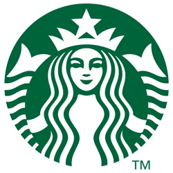
8. Starbucks Logo
Mermaids of Greek mythology are the inspiration behind the Starbucks logo. That is the reason behind selecting a mermaid in its logo, as it is inspired by the mermaid’s superpowers, which attract sailors and ships towards them. Similarly, Starbucks will attract every coffee lover towards it.
It was first designed in 1971, and since then, it has undergone numerous changes. Initially, it had a highly complex style, which was not particularly attractive.
In 1987, the company was acquired by Howard Achultz. The logo was redesigned, and thanks to him, it now has a very modern and clean look. Whereas the mermaid, which is its signature look, remains the same.
Using white and green colours and giving it a clean look, it is one of the most successful logo examples ever created. Now, the mermaid is the symbol of Starbucks’ success and logo.
You can also create a logo inspired by different mindsets, and that story can gain a vast audience.
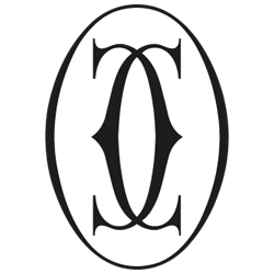
9. Cartier Logo
Now, I am going to tell you about a legendary logo that has ever been made. It is a logo that was never altered or redesigned, and its name is “Cartier”. Cartier is one of the most reliable and luxurious brands worldwide, offering a range of high-end products, including bags, watches, and fragrances.
Its logo was first created in 1900, and it has remained unchanged in style since then. An interesting fact is that no graphic designer or a large design firm creates it. Pierre Cartier, the grandchild of the founder of the Cartier company, designed it.
It is the simplest logo ever made. Cartier only includes the name of the brand, nothing else, but is written in a way that still looks sleek and elegant, in line with modern trends.
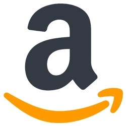
10. Amazon Logo
If you want to know about the most complex logos ever made, then at the initial stage, the Amazon logo was one of them. If you look at the first two logos of Amazon, you will notice that there was only an “A” in them, accompanied by a river.
However, if you see the Amazon logo now, then you will notice a curved arrow in its name, from A to Z, which indicates that it covers every single product in the world. It also depicts a smile in a curved arrow form, indicating customer support and satisfaction with the service.
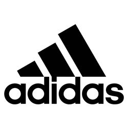
11. Adidas Logo
We have discussed Nike in detail; now it’s time to examine the logo of its biggest competitor, Adidas. You may have noticed that multiple Adidas logos are still in use, despite the company not removing any of them from existence. Each of them has a unique story behind it.
However, one thing remains the same in every single logo, and that is the three stripes. These three strips show that Adidas is available in the three parts of the world: Asia, North America, and Europe.
Have you noticed that its name always starts with a small letter? The reason behind it is that it emphasises that this brand is for every kind of accessible sports wear.
It is admirable that a brand has managed to maintain multiple logos to stay in existence.
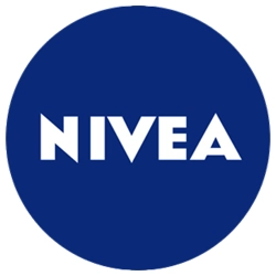
12. Nivea Logo
One of the most popular logos in the existing design space is the Nivea logo. Nivea has a straightforward and iconic logo. It has used a blue and white colour palette as its colour scheme and simply included a name with it.
If you have watched the “Times Square” show, then you may have noticed that Nivea is always in its place there. However, it’s a very successful brand worldwide, and it still endorses and runs promotions of itself.
It’s a great logo example that displays a brand’s professional and reliable appearance.
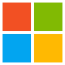
13. Microsoft Logo
We have discussed multiple brands across various domains, but let’s focus on the most successful tech company in the world: Microsoft.
Microsoft has changed its logo many times as the world has evolved. The 1970s disco era inspired its first appearance. In 1980, it then adopted a rockstar band appearance.
In 2012, it was redesigned and still maintains a strong presence due to its sophisticated look. It has a Windows look with four colours.
All four colours are not chosen randomly, whereas they are designed with a firm intention behind their use. The red colour represents the Office suite or PowerPoint, while blue represents Windows or Word. The other two colours are green, representing Xbox or Excel, and yellow, representing Bing or Outlook.
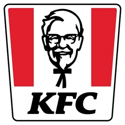
14. KFC Logo
While discussing McDonald’s, how is it possible that it doesn’t consider its biggest competitor, KFC? When thinking of KFC, the first thing that comes to mind is fried chicken, accompanied by the image of Colonel Harland Sanders in the KFC logo. Multiple companies use fictional characters for their logos; the KFC logo features its own founder’s image.
The KFC logo was first designed in 1952, and since then, it has featured a picture of its founder. The latest one was created in 2018, in which the Colonel character is changed, such as adopting a smiling face.
From the KFC logo, you can understand that when selecting a mascot for your logo design, you must be very careful. Because if people then recognise your brand’s image with that character, then it will become hard to change or remove it.
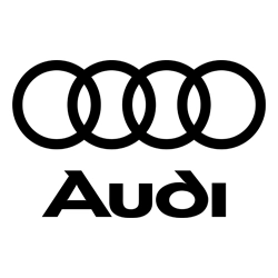
15. Audi Logo
In the automotive industry, one of the biggest and most stylish brands is Audi. The first logo in Audi’s history was created in 1930, featuring four rings. These four rings displayed the presence of four different companies, including Audi, DKW, Horsch, and Wanderer.
Throughout this time, it has undergone numerous changes, but one thing remains the same: the four rings. In these times, it has changed its colours and also removed its name from the logo. The final appearance we see now was designed in 2016, featuring just four rings.
This looks gives it an extreme and powerful appearance. From this, you can get an idea of how brands can remove their name from the logo and make their symbol.
Like the five rings are for the Olympics, the four rings are for Audi.
Final Thoughts
These are the details about the inspiring logo examples you can get an idea from to design one for your brand. I am seriously impressed with the way Google has designed its logo and make it a unique identity by integrating its Doodles according to the events.
Similarly, others mentioned in this guide deliver the same message that a uniquely designed logo can be the best asset for your company if it is capable of attracting the audience.
Creating a logo as a beginner can be a simple and rewarding experience. You just need the right editing tools and ideas. Focus on precise meanings and simplicity to reflect your brand.
Start practising today, and let your creativity shine!
Need custom app with amazing features?
Get a Quote